Alumn Michael J Quinn Featured On Phoblographer
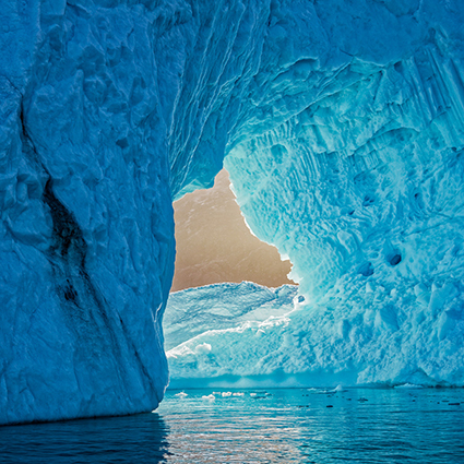
Saga_of_Ice_2
Alumnus Michael J Quinn was recently interviewed and his work featured on Phoblographer.
Here’s an excerpt.

Phoblographer
“When you’re surrounded by so much awesome beauty from nature, how to do control yourself and not take pictures of everything?”

Michael J Quinn
“In the beginning, I did take pictures of everything. Not uncommon for me to shoot 10,000 images during a week trip, which is way too much. It makes editing and pairing down images almost impossible. The sorting process becomes daunting and thus does not get done. It is only after repeated trips and mentoring by both John Paul Caponigro and Seth Resnick, that I have begun to see better in the field. Make much fewer captures but at the same time increase the quality of the images that I am capturing. I am able to pre delete images before capture. That is to say that I can mentally edit.

Is this shutter click going to result in at least a 3 star image? If not, don’t click. This is a learned trait and must be practiced. I still have a long way to go, but I am making progress. During my recent 4 week trip to the Arctic, I shot less than 5,000 images. This makes the editing process much easier.

I have more confidence in my abilities which plays a role too. I have the confidence that I can capture the scene with enough depth of field, exposure and focus. Slowing the capture process helps as well. If there is time, taking a moment to really look deeply at a subject, interpret my emotional response to a scene and then make the capture. Having a plan also helps in the capture process. Plan out what type of story or stories that you have going and where the holes are in your story. Then when you are in the field you have a shot list of images that you are looking for. It makes it much easier to sort through the chaos in the field and find the gems. You have to be prepared for the new opportunities that arrises as well – like when a Polar Bear pops his head out around a rock, but having a plan will focus your attention. Reviewing while in the field is also a valuable tool. You can confirm that your technique is working. You can look for new patterns and themes in your images. Finding new stories to tell is always exciting.”

Read the rest of the interview here.
Learn more about Michael J Quinn here.
Read more Alumni Success Stories here.

Alumnus Michael J Quinn’s New Print Portfolio

Quinn_2 Quinn_5
I have been honing my photographic skills over the last several years. Making strides in composition, storytelling and mechanics of photography, I still lacked some finer processing skills and the art of printing. I decided that a print is the ultimate goal of a photographer. There is just something very tangible, very permanent about a print. Anybody can flick through a series of images on an electronic device. But actually taking the time to make a print, matting, framing, hung on the wall and lit well -takes considerable more effort. It also then requires more contemplation by the audience. I think they place more weight and value on the print than in electronic form. They are more willing to commit more time with the print.

During the span of a year, I completed both of John Paul’s Intermediate and Advance printing classes. At that point, I believed that I had achieved the skills required to attempt my own Print Portfolio.

There is just something substantial about the physical print. Let’s face it, we can casually look through tons of images on our electronic devices. They are there and then gone. But having a book full of prints is something completely different. You engage two more of your senses, touch, and smell. Every book has a certain feel and personal experience to it. It evokes more of an emotional response than the electronic equivalent.

So my goal with this project was severalfold.
1. Create a body of work of 24 images
2. Improve my image processing
3. Improve my print quality / skills
4. Share with as many people as I can
A decision had to be made on the format of the book. Landscape, Portrait, or Square. I deiced that the square format was the most versatile of the three. With a square book, I could print any aspect ratio that I wanted and not feel constrained to a particular style. Since I knew this book was going to be a work in progress and may change over time, I thought being versatile was a good trade-off versus being locked into a portrait or landscape format.

The next decision that I had to make was the size of the book. I based this partly on the common size of paper available. The other influence was what kind of reaction I wanted from people when they viewed the book. I made 5 prints on 13×14 inch and 17×18 inch papers and then just stapled them together to simulate the two sizes of the book I was considering. I printed horizontal, vertical and square images. I had my own opinion and then solicited several peoples opinions. The larger size won hands down. You would not think that 4 extra inches would make that dramatic of a difference but it really did. It took the scale of the book from something casual to something cherished. The larger size was just so much more engaging.

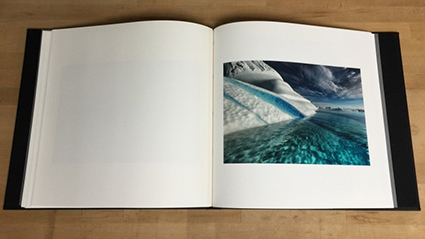
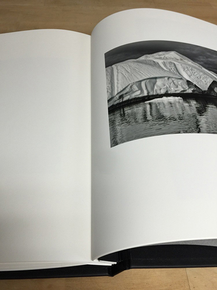
The paper choice for my Epson 9900 printer, (after some experimentation) Epson Ultrasmooth. It brought an extra dimension of depth to my ice images. The warmth of the paper gave an extra separation to the printed images. I decided that the easiest form factor would be to use 17″ wide roll paper. Then I would just allow the printer to cut the sheets to a length of 18″. This way I would not have to do any post printing trimming of the prints.

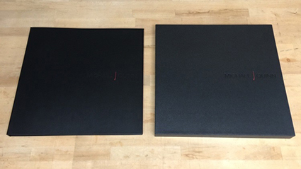
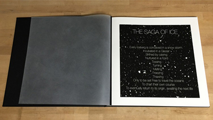
For the physical book, I had a custom binding post book and slip cover made. I choose the binding post style so that it would be easy to replace prints and so that I could completely change the theme of the book if I desired. For materials I choose Black on Black on Black. This might be generic, or called corporate, but I liked the neutrality of it and its future potential. Each of the three surfaces were a different material, so that added a subtle variation to the book. I added just a splash of Red into my debossed logo. The inner front and back sheets are sanded mylar. This essentially adds an end sheet to the book and enhances the experience when opening the book.

Quinn_3
Quinn_4
I learned a lot through this process. It was a great growth experience. Having a project focuses your mind and creativity. Completing a project gives you a sense of accomplishment. Sharing the experience – I hope I can inspire all of you to do something wonderful.

Find out more about Michael J Quinn here.