Black & White Mastery

Download your free copy now!


Explore the wonderful world of black-and-white, a special form of color.

Seeing In B&W
What’s unique about black-and-white, and how to best adjust and print it.

What’s Unique About B&W
Black-and-white is special in so many ways.

Expanding The Definition Of B&W
The term “black & white” is not as simple as you might think.

How Gray Is Gray ? 
Both context and personal preference make this a surprisingly challenging question.

Why You Need To Understand Color To Get The Best B&W Images
Color affects the exposure, processing, and printing of black-and-white images.

An Overview Of Color To B&W Conversions
My preferred workflow for color to black and white conversions.

Optimizing Files Before B&W Conversions
Prepare your color images before conversion to black-and-white to gain maximum control.

Why Desaturating Is The Worst Color To Black & White Conversion Method
Simply desaturating reduces tonal separation.

A Dozen Ways To Convert Color To B&W – And Why You Only Need Two (Coming Soon)
Simplify your workflow.

Lightroom / Camera Raw  – B&W Conversions (Coming Soon)
When global conversions are enough.

Photoshop  – B&W Conversions
When you want to localize conversions.

How To Create The Best Color To B&W Conversion Previews
Exploring your options before you commit to a final solution is time well spent.

Simulating Infrared | .99
Create the look of infrared with Adobe Photoshop (all versions)

Enhancing Local Contrast In B&W Images
The best ways to dodge and burn detailed.

5 Strategies For Adding Color Back Into B&W
Why and how to add color back into black-and-white photographs.

Top 5 Ways To Add Color To Black & White 
By adding color to your black-and-white photos, you can enhance their expressive qualities.

Hand-Coloring B&W Photographs (Coming Soon)
How to achieve complex and convincing effects with this compelling palette.

Black & White Signature Styles 
Like so many other artists, you, too, can learn to craft a unique black-and-white look.

5 Photographers With Signature B&W Styles 
Study the masters to find new possibilities in black-and-white photography.

Why B&W And Color Don’t Mix
They’re two different realities; unless you use them as a code for that, present them separately.

Epson Driver – Advanced B&W Photo
Use the Epson driver to make the best black-and-white prints.

Watch The Essence Of B&W Mastery


Sign up for Insights for news of new content!

Why Neutrality In Your Images Is So Important

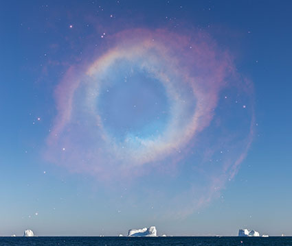
Constellation_XIX_425

Achieving neutrality in your images is so important. Few things are as important. Why?
Here are four reasons.

1 – The color in your images will appear more believable.

Casts make colors seem false. This is true for memory colors like fire engine red, sky blue, and grass green, particularly true for flesh tones (Are you feeling a little bit green today?), but nowhere more true than with neutrals. There can be some debate about which blue is sky blue. On which day? At what time? But there’s very little debate about what gray is truly neutral. Sure those neutral grays can vary in brightness but not hue or saturation. Make the neutrals in your images truly neutral, and you’ll make the other colors in your images more believable.

2 – The colors in your images will look more saturated.

When you remove color casts you can see the colors beneath them more clearly. The color beneath appears purer. This effect won’t be as strong as if you had increased their saturation. It will be subtler but more convincing. Oversaturated colors often appear false and you’ll have to work the saturation of your colors twice as hard if they contain color casts. Clean color is a great foundation to add saturation to. You can get the best of both worlds.

3 – Your images will appear more three-dimensional.

Without casts, the colors in your images will have more contrast.

They’ll have more luminosity contrast. When they’re not unified by a color cast, luminosity or brightness values will become more distinct.
They’ll have more hue contrast. Often shadows will appear cooler while highlights appear warmer, making them appear even more different than they already are.

They’ll have more saturation contrast. When neutrals are neutral, you’ll get maximum contrast between them and the more saturated colors in your image.

Add these three kinds of color contrast together, and you’ll see a dramatic difference in your images. The illusions of three-dimensional depth and volume in our two-dimensional images will be significantly amplified.

Once again, these effects will be powerfully felt but not obvious. Clean colors won’t call attention to themselves because they seem natural, unlike imbalanced images that you’ll need to over-process to get similar effects.

4 – You’ll have the best color foundations to make black-and-white conversions from.

It sounds strange when you first hear it but color matters even when you’re going to remove it. The maximum hue and saturation separation created by achieving neutrality gives you more control over how dark or light to make hues during conversions to black and white.

5 – You’ll know color management is working.

Neutrals are one of the first things to look for when you’re checking your color management for printing, whether it’s evaluating a viewing light, examining a profile, a rendering intent, or a media setting. You not only look for neutral midtones but also neutrals throughout the entire tonal scale (gray balance). If you’ve achieved both your color management is working correctly. If not, check your system.
I’m sure you’ll find a few more reasons why neutrality in your images is so important.

Achieving neutrality in your images isn’t something you do for all of your images. There are many exceptions. Nevertheless, being able to achieve neutrality in your images is a critically important skill. When you know how and why to achieve neutrality all of your color choices become more sensitive, deliberate, and meaningful.

Read more on Color Adjustment here.
Learn more in my digital printing and digital photography workshops.