Framing

framed
You’ve been framed. It sounds terrible right? But, when it comes to your prints, it’s great. It’s a sign that after all that work you’ve arrived.
Think of how many photographs you make; a lot. Now think of how many of those actually get selected and processed; a few. Now think of how many of those actually get printed; fewer. Now think of how many of those actually get prepared for formal presentation, mounted and matted, perhaps for a portfolio; fewer still. Finally, think of how many of those actually get framed; even fewer still. The images you frame are a very small percentage of the total umber of images you create. They’re the rare few.
Framed images represent your very best work. Framed images are the ones that go on your walls or someone else’s walls. You spend the most time with them and live with them the longest. They represent your work publicly. They’re the ones used for exhibitions. They establish your reputation, and once made, reinforce or elevate it. If you’re a fine artist, framed images are the images that generate a significant amount of your income.
You’ve got choices. And the choices you make speak volumes to your viewers. There are so many framing choices available to you it’s easy to get lost in endless details. Identifying a few broad categories or types of frames can help you focus on specific areas, where details become important rather than superfluous.
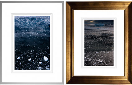
Frames can be simple or complex.
Frames come in many sizes, from thin to thick.
Two framing materials are used more than any others – wood or metal.
Consider framing fashion for your images. Dress your images appropriately. The right fit will make your images look like a million bucks. Presentation enriches a viewing experience. The wrong fit may seem cheap, be distracting, or even send conflicting signals to viewers and put them off. Your viewers may not think twice about or have a second look at your images. Since there are so many types of images, no one size or style fits all.
Would you go out in public naked? Don’t let your artwork go out into the world poorly presented and unprotected.
This is an excerpt from the current issue of Photoshop User magazine.
Read more in PhotoshopUser magazine.
Find out more with my free Lessons.
View more on my DVD Fine Art Digital Printing.
Learn more in my Workshops.

Gloss Differential

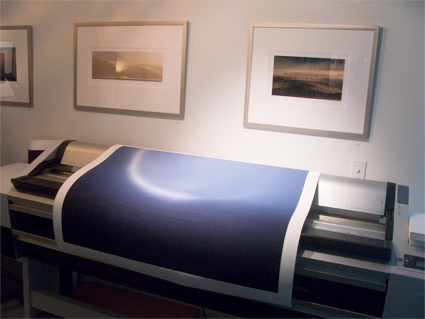
Gloss differential is an uneven reflectance of the surface of a print. In inkjet printing, very dark colors are produced with substantial amounts of ink while very light colors are produced with little or no ink. This can produce differences in reflectivity throughout the surface of a print in many images. While this is not an issue for most matte surfaces, it can be distracting when looking at glossy prints under specific angles of light.

Recent ink technology includes additives designed to reduce gloss differential to produce more even print surfaces. In addition, some separation routines reduce it even further. Epson printer drivers include two features in their Advanced Black and White mode, Highlight Point Shift and Highlight Tonality slider, that can be used to reduce gloss differential. Running these settings to a maximum virtually eliminates gloss differential. Because clear and very light black ink are used in these delicate areas, this darkens the print only slightly. You can compensate for this by lightening the file before printing.

How can you identify gloss differential? Make a print with very bright highlight areas. Look at those printed areas under bright light while varying the angle of the surface of the print and compare the reflectance you see there to darker surrounding areas.

What can you do to reduce gloss differential? Use the latest inksets. Optionally, use the most recent black and white software routines to reduce it even further. (Epson’s Highlight Poiint Shift is designed for this.) Hold your highlights slightly full to avoid paper white, which will be less reflective. Finally, consider spraying, varnishing, or waxing the surface of your prints.

Read more with my online Printing Resources.

Learn more in my digital photography and digital printing workshops.

Bronzing

Bronzing is an iridescent flash of color, typically bronze, produced when viewing prints under varying angles of light. It’s produced by pigmented ink’s tendency to refract light. It’s most visible in black and white prints but affects color prints as well. It affects glossy surfaces almost exclusively.    

Optimum choice of ink and precise placement makes the difference. Recently, new separation routines and screening algorithms have been devised to place droplets of specific ink colors, in specific patterns, in combination with other inks to dramatically reduce bronzing.

How can you identify bronzing? Look at the surface of a glossy print in near direct light. Change the angle of the print and look for a flash of bronze near areas of glare.

What can you do to eliminate bronzing? Choose the best inksets and drivers. (Optionally, print on a matte surface.) This will all but eliminate bronzing in your prints.

Read more with my online Printing Resources.

Learn more in my digital photography and digital printing workshops.

Metamerism

3500 K

5000 K

6500 K

Metameric failure is the tendency of an object to change its appearance under different light sources. Different light sources, even of the same color temperature, are often comprised of differing amounts of spectral frequencies (i.e. red or blue frequencies). Some objects change appearance more quickly than others; they are more metameric. This is true when comparing dye-based inks with pigmented inks. As pigments are made of irregular particles, they tend to refract (reflect and bend) light more strongly than uniform dye globules. The most current ink technology coats pigment particles in resin to reduce this effect. Additionally, some color pigments, typically the most saturated ones, are more prone to metamerism. By separating the file differently and using more of the less metameric ink to reproduce an image, the print’s appearance stability is increased. This is particularly important when reproducing neutrals, as small shifts in hue are quickly detected in these colors.

How can you evaluate metameric failure? Make two prints of the same image (preferably containing significant neutrals) and compare them side by side in different light sources.

What can you do to reduce metameric failure? Use the latest inksets and drivers (with the latest separation routines). And, when practical, standardize the light your prints are viewed under. Can metamerism be completely eliminated? No. Everything is metameric. But metameric failure in prints can be reduced to the point where it is no longer significant or noticeable.

With new technologies come new possibilities and new challenges. Recent advances in inkjet technology (ink formulation, separation routines, and screening algorithms) are making noticeable gloss differential, bronzing, and metameric failure things of the past. It pays to stay informed of the latest developments in printing technology. Your prints will simply get better.

Read more with my online Printing Resources.

Learn more in my digital photography and digital printing workshops.

2880 vs 2400 – Gamut Comparisons


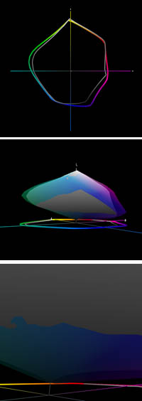
Today, Mac Holbert and I started teaching The Fine Art of Digital Printing at the Hallmark Institute of Photography in Turners Falls, MA. Epson shipped in new 2880 printers for this special event. Epson’s new 2880 uses UltraChrome K3 with Vivid Magenta. How much does Vivid Magenta expand the gamut? Check out these diagrams – 2D, 3D, and 3D looking at Dmax. The 2400 is in white and the 2880 is in full color. Both are graphing Epson Premium Luster Paper. The graphs indicate warm blues, magentas and greens are where it pays off. Slight increase in Dmax. It’s not a dramatic increase but in specific images (polarized skies and saturated foliage, it can be significant. There are also slight tradeoffs in other areas of the spectrum (wherever the white volume extends beyond the color volume).
Words and pictures can work together to tell a fuller story. These diagrams were made with Chromix’s ColorThink. I use it to graph ICC profiles and compare substrates and to compare inksets. Doing this more clearly illustrates the pros and cons of each.
It’s something I do in all of my color management sessions (like the whirlwind tour of color management participants in the FADP workshop got this morning and the sessions you’ll find on my DVD 6 Simple Steps to Color Management).
Check out my Review of Chromix’s ColorThink used to make these graphs.
Check out Chromix here.
Check out my earlier post on the 2880 here.
Check out the 2880 here.
Check out our workshop the Fine Art of Digital Printing here.
Check out my Fine Digital Print workshop series here.
Check out Hallmark’s post on today’s session.

On Press – Banding


We’ve been finishing the last prints for my annual open studio exhibit where I unveil New Work from 2008 for the first time. We ran into subtle banding in a few prints. So how do we trouble shoot it?
First check the file at 100% screen magnification. If it’s in the file add a touch of noise. If you need to use more noise than you’d like, use Noiseware afterwards.
Second check the printer. Is the data transfer fast enough? (Don’t perform other calculation intensive operations while printing. Close other programs if necessary. Make sure your cable connection isn’t too slow or too long.) Are the heads aligned? Are you sure it’s banding and not nozzle clog? (Nozzle clogs are tiny light lines. Banding is dark lines, often thick with soft edges.) Are you printing at high speed? (Try printing it slower.)
Third, as a last resort, rotate the image 90 degrees and try printing it again. Huh? Right! Many of my files are particularly difficult to print – semi-neutral fields with very smooth gradations. These types of images display incompatibilities with printer drivers and their screening frequencies that just don’t happen in most images. It has to do with screening frequencies. Why does rotation help? I don’t have an explanation for it. But it works.
Hopefully all of this will help you with your prints.
Get information on my Annual Exhibit here.
Check my blog for the most up to date information on the event.
Check out my blog during the event to see video of my new installation events.
Check out my Gallery to see more images.
Check out my Gallery during and after the exhibit to see new images.
Check out my workshops series The Fine Digital Print here.

Christopher James – Artist's On Art


Alternative process master Christopher James speaks in this in-depth conversation.
“The salted paper process is unpretentious, low in acidity, with hints of pencil lead and musty cork and intense spicy aromas of cinnamon, beach plum, and low tide. It has an “old world” nose and often pampers the optical palate with a touch as light as a feather. A perfect salt print has shades of aubergine and is delicate, subtle, understated, and prized for its shyness.
The kallitype is a muscular and exuberant process possessing, upon first impression, a rich, briary, saddle leather, and full bodied character that would pair well with sardines or fried clams. It is so black it even tastes tarry. But if the intensity of the blackness borders on too severe, it redeems itself with textural finesse. Often mistaken for platinum, the kallitype has a reputation for yellowing in its highlights, a condition that can be rectified by developing it in a soothing blend of sodium acetate and ammonium citrate.
The anthotype is a charming and organic process that celebrates all of the components of a great honeymoon… flowers, alcohol, and long exposures to sunlight. It is a fragrant and aromatic process that is chemical free, magical, and yields a romantic and diffused image that Pre-Raphaelites and grammar school children love.
The gum bichromate process is a mischievous little technique that is renowned for rewarding the playful and patient. Practitioners who indulge in this time consuming exercise are universally pleased with a full throttled and multi-chromatic runway to creative adventure. Gum prints are dense, chewy, and robust and improve with age. When they have reached their perfect end, they are loaded with opulent, even unctuous layers of fruity coloration, and a huge bouquet with a plump, luxurious, texture that is quite decadent.”
Read the full conversation here.
Read this month’s issue of Camera Arts and see a portfolio of Chris’ work.
Find out more about Chris here.
Find his new book here.
Sign up for Insights and get previews of upcoming conversations here.