4 Ways To Crop Your Images – Crop, Distort, Retouch

Deciding what’s in the frame and what’s out is a critical decision that can make or break an image. You can look at it very simply. What is an image of? What is an image not of? And how does what’s left over support or distract from the essence of an image?

In the past we had two simple options; one, use the frame to crop; two, crop when printing or post-processing. Now we have two more options to think about; three, distort; four, retouch. Each of these offers different possibilities and becoming familiar with them all will help you choose.

It’s a new mindset. Once you learn to see in these new ways, you’ll find you’ll make images that you previously passed by, leaving them unmade or even unnoticed. As a result, you’ll make many more successful images.

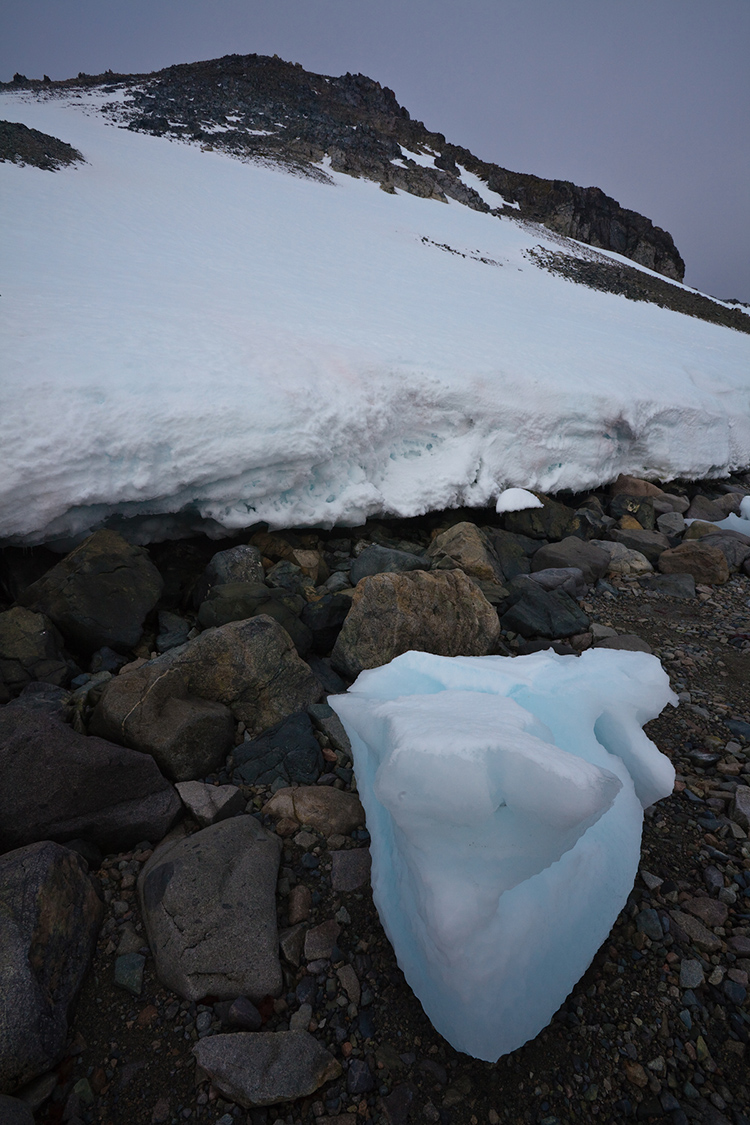
Classic crops eliminate the most information

Crop

You’ve got choices. Choose wisely.

One – Crop Before Exposure

Use the frame to eliminate distracting information around a subject(s). Take extra care with image information that touches the frame, as it will draw extra attention. If part of an object is eliminated by the frame make sure what’s left looks deliberate - just a sliver lopped off or a sliver left over seems careless. Once you’ve made your exposure, you’re committed. You can crop more but you can’t uncrop. When in doubt, shoot both tight and loose.

Two – Crop After Exposure

Shoot loose (more than you need) and you’ll preserve your ability to refine a composition during post-processing, testing, and comparing many variations, even over extended periods of time, before settling on a final solution. Doing this will take more time but you will gain precision.

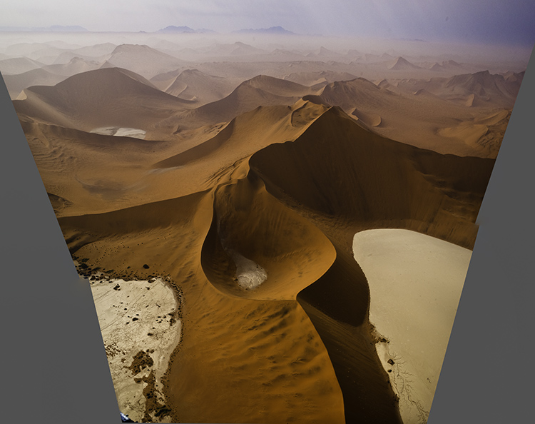
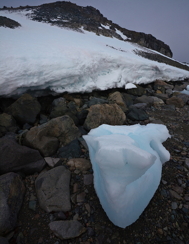
Distorted to fill the frame

Distort

Distorting photographs is widely practiced. But most photographers tend to think of their limited use of distortion as having produced no distortion. In fact, every lens distorts in its own way, some more than others, like wide-angle lenses. Lens profiles are designed to correct for lens distortion during post-processing by ‘undistorting’.

Many people think they aren’t distorting their photographs when in fact they are doing it on most of their images in multiple ways, first by using a lens, second by using a lens profile, and sometimes third by creating panoramas. Why are these practices more acceptable than using distortion and retouching as a part of your cropping practices? In the end, it’s your choice.

You can push one or more sides of an image outside its frame and achieve similar results to cropping. What’s different here is that the proportions of the objects and spaces left within the frame will change, typically getting taller or wider, usually only a little but potentially a lot.

You’ve got options. Test them before you settle on your final solution.

One - Transform

Use Photoshop’s Edit > Transform to distort an image uniformly. To move an entire side, hold the Shift key to move one side without moving the others.  And/or, to move one corner independently, press the Command key before moving a corner point.

(To do this an image’s Background Layer needs to be a Smart Object or a duplicate layer.)

Two - Content-Aware Scale

Use Photoshop’s Edit > Content-Aware Scale to distort an image non-uniformly – smooth areas will expand or contract more than textured areas. Pull the areas you wish to crop outside the frame. Hold the Shift key while you’re doing this if you wish to change one side more than another and the image’s aspect ratio with it.

(Do this on a duplicate layer. Content-Aware Scale doesn’t work on a Smart Object.)

Three - Warp

Want more localized control? Try Warp. (Edit>Transform>Warp) Warp gives you a grid to adjust more points with. It adds the ability to modify the position of elements not just with the edges but also the insides of the frame. Do this on a duplicate layer or duplicate Smart Object. Warp works on Smart Objects but since it is not a filter so you can’t get the future flexibility of a Smart Filter.

Four - Liquify

You can use the Liquify filter to distort small portions of an image. For instance, moving something in the middle of the edge of a frame off frame without moving the corners. To do this,  go to Filter>Liquify, start with the first tool Forward Warp and use the brush to get the effect you desire. It’s worth exploring the other brushes too as Liquify is a powerful distortion tool.

Distorted to fill the frame

Distorted version with aspect ratio changed afterward

Preserve Or Adjust Aspect Ratio

Both cropping and distortion may or may not change an image’s aspect ratio (the proportions of the frame). Cropping can be set to preserve a set aspect ratio but this puts limits on what’s possible as at least two edges, if not all, are adjusted together. if you adjust one edge separately from the others you’ll change the aspect ratio, for better or worse. But if a specific aspect ratio is important to you (either because the original creates consistency between images or because a new ratio is more expressive), after cropping you can distort the entire frame to the aspect ratio of your choice.


Insights Members can login to read the full article.
Email:
or Sign up

4 Ways To Divide Your Images’ Frames Expressively

Dividing The Frame

The four most important lines of any image are the ones that are often least recognized consciously – the frame.  Second only to these are the lines that divide the frame, creating frames within the frame. Becoming more aware of how the frame can be used and how it can be divided will help you make more successful compositions.

There are many ways the frame can be divided. You can divide the frame horizontally, vertically, or diagonally; in each case the layers included define the virtual space presented. Different areas in an image can be divided differently. You can divide the frame (or a frame within the frame) multiple times; the more times the frame is divided the more packed and dynamic it becomes, progressively growing more design-oriented and finally being reduced to pure texture. Each operation has significant consequences.

One of the most significant results of dividing the frame is the creation of specific proportions. (The combination of the individual aspect ratios of each element creates a new unified aspect ratio.) Much has been made of the ‘rule of thirds’. Dividing the frame into three parts (left/center/right or up/middle/down) is a simple and often useful strategy for making images more directed, by prioritizing one element over another, and dynamic, through imbalance. Too little has been made of other ratios. What of fourths, fifths, sixths, sevenths, or eighths? No musician would be content to only divide an octave into halves and thirds. Every proportion produces particular effects, which are further modified by placement (high/low or left/right) and content. Rather than a rule to be adhered to, proportion is a force to be explored expressively.

When it comes to controlling the division of the frame in your images, you have more options available to you than you might think. You can crop, distort, retouch, or composite.

Before and after cropping

Crop

Cropping, either through placing the frame during exposure or by eliminating framed information during post-processing, which changes the aspect ratio, has been the most traditional way of dividing the frame.

Before and after distortion


Insights Members can login to read the full article.
Email:
or Sign up

Crop, Distort, Or Retouch ?

1_top

Top frame of a panoramic stitch

2_bottom

Bottom frame of a panoramic stitch

3_distortedframe

Panoramic stitch

5_filled

Panoramic stitch distorted

4_cropped

Panoramic stitch cropped

5_filled

Panoramic stitch cropped and retouched

6_filled_large area

Panoramic stitch retouched

The strategies above are not limited to panoramic stitches.

We’re responsible for everything that’s in the frame. We’re also responsible for everything that’s not in the frame. Deciding what’s in the frame and what’s out is a critical decision that can make or break an image.

Here are two essential framing strategies.

One. Use the frame to eliminate distracting information around a subject(s). Take extra care with image information that touches the frame, as it will draw extra attention. Do this with significant compositional elements.

Two. Eliminate excess space around a subject(s) to focus the attention of the viewer. A lot of surround space between the subject and the frame can be used to use to call on psychological associations with space, such as freedom or isolation. Some space between the subject and the frame can give the appearance of the subject resting gracefully within the frame. Touching the subject with the frame strongly focuses the attention of the viewer and may seem claustrophobic. Cropping the subject with the frame can focus the attention of the viewer on specific aspects of the subject and/or give an image a tense quality, evoking evasion and incompleteness – this often seems accidental if less than half the subject is revealed.
Cropping is extremely simple to practice. (While cropping techniques are simple to practice, the reasons for their application and the choices made about how to apply them as well as the final effects may be exceptionally complex.)

Here are two cropping choices.

One. Reposition the frame before exposure.

Two. Contract the position of one or more of the borders of an image after exposure, generally with software.
Because distorting an image during post-processing, by expanding or contracting one or more sides or corners, is a relatively new possibility, most people don’t think of exercising this option. Ironically, anyone who uses lens profiles distorts their images in post-processing to correct lens distortion. Consider this a creative supplement to and extension of that practice. While cropping potentially changes the aspect ratio of an image, distortion does not.

Here are two distortion choices.


One.
 Use Photoshop’s Edit > Transform to distort an image. Push the areas you wish to crop outside the frame. Move one or more sides by pulling the point in the middle.

Two. Use Photoshop’s Edit > Transform to distort an image. Push the areas you wish to crop outside the frame. Move one or more corners by pulling the corner point while holding the Command key.
Retouching used to be complex. Today it can be simple. Never before, has retouching been so easy to do or the results so sophisticated. (To be certain, not all retouching is simple. You can make retouching as simple or as complex as you choose to make it. Retouching is an art that continues to be elevated on a daily basis. But what once required specialized tools and a Herculean effort can now be done with standard software in seconds.)

Here are four retouching choices.

One. There’s cloning. Simply use the Clone Stamp Tool set to Current and Below on a new blank layer. (This will ensure that any retouching can be removed or redone at a later date.) Hold the Option/Alt key and click to sample information to copy, then move the cursor to the area you’d like to copy the information to and click and drag. Repeat until a desired effect is achieved. Typically, donor information is drawn from the same document but you can also clone from one image or file to another.

Two. There’s healing. Use the Healing Brush Tool as you would the Clone Stamp tool. Or, use the Spot Healing Brush, which will automatically select the information sampled for you and can be used within a selection to contain the results. Or, finally the Patch Tool, which will copy information selected with it from or to (depending on whether you check Source or Destination) wherever you drag it to. Healing can’t be done on a transparent layer, so work on a copy of the layer you’d like to retouch. Click on the layer and select Duplicate Layer from the Layer menu or palette. If you need to heal image material contained on multiple layers, create a new composite layer by holding the Option/Alt key select Merge Visible from the Layer palette.

Three. There’s copying and pasting. Just select a region of an image with any selection tool. Copy it. (Edit: Copy) Paste it. (Edit: Paste) Then move the resulting layer into play and mask as needed. (Click the mask icon at the bottom of the layer palette and use a black brush at varying opacities to hide the information.)

Four. There’s filling. Select a region. Fill with Content Aware fill. (Edit: Fill and select Content Aware from the drop down menu in the dialog.) (This feature was introduced with Photoshop CS5.) Photoshop will automatically create an appropriate random texture in the selected area. Like healing, this feature won’t work on transparent layers/areas so, again, use it on a new merged layer.

Software routines such as lens correction and panoramic stitching may distort the frame, subtly but sometimes significantly distorting a composition, and requiring additional measures to restore a rectangular frame. When solving this challenge, you may get better results if you don’t contract the frame as aggressively as you once did and retouch rather than crop to fill in the gap and/or eliminate distracting elements.

Your choice of practices or their application may or may not change the nature of the artifact that you finally create. And, whether the means you choose is appropriate for your objective, the practices you adopt may or may not be accepted by the community of artists you choose to work within – some are more permissive than others. Nevertheless, you should explore your options. You simply won’t know whether it’s for you until you try it for yourself.

Learning to think within the frame is an essential skill for creating strong photographic compositions. But today, learning to think within the frame is only the beginning. You can learn to think outside the frame as well.

It’s a new mindset. Once it becomes second nature, you’ll not only find you have more options for visual problem solving but you’ll also find your visual horizons will have expanded – significantly.

Learn to see in new ways. Combine them with old ways. You’ll find you’ll make images that you once passed by, leaving them unmade or even unnoticed. As a result, you’ll make many more successful images.

Read more in my Exposure lessons.
Learn more in my digital photography and digital printing workshops.
Crop or Retouch ?


As visual communicators, we’re responsible for everything that’s in the frame; we’re also responsible for everything that’s not in the frame. Deciding what’s in the frame and what’s out is a critical decision that can make or break an image. Here are two essential framing strategies.
1.?Use the frame to eliminate distracting information around a subject.
Take extra care with image information that touches the frame, as it will draw extra attention. Do this with significant compositional elements.
2.?Eliminate space around a subject to focus a viewer’s attention.
A lot of space between the subject and the frame can be used to call on psychological associations with space, such as freedom or isolation. Some space between the subject and the frame can give the appearance of the subject resting gracefully within the frame. Touching the subject with the frame strongly focuses the attention of the viewer and may seem claustrophobic. Cropping the subject with the frame can focus the attention of the viewer on specific aspects of the subject and/or give an image a tense quality, evoking evasion and incompleteness—this often seems accidental if less than half the subject is revealed.
There’s more than one way to apply these strategies. While cropping techniques are simple to practice, the reasons for their application and the choices made about how to apply them, as well as the final effects, may be exceptionally complex. You have two choices ..
1. Reposition the frame before exposure.
2. Contract the position of the borders of an image after exposure
If you plan to retouch, you’ll frame and crop differently …
Read more at Digital Photo Pro.
Find more digital photography techniques here.
Learn more in my digital photography worskhops.