13 Go To Fonts, 7 Fonts to Avoid
Whether you’re designing for a book or a presentation choosing the right type face is important. The font you choose helps shape the tone of what you create. As with any endeavor, it helps to have a trusted resources you can always turn to.
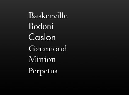
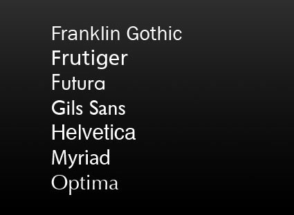
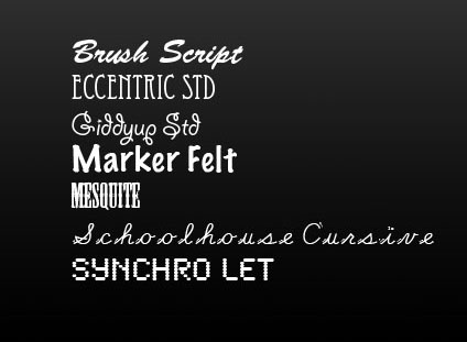
Here are my go to serif and sans serif fonts … and a few I steer clear of.


Serif and san serif and the most common kinds of fonts. Serif fonts have a classic feel. Sans serif fonts set a contemporary tone. Decorative or display fonts have a great deal more flair and are generally best used for signage; it takes the right project and a great designer to use them well in other applications. Design is typically best used as a support for content, not a distraction from it or a substitute for it.
Find books on design I recommend here.
Learn more in my Fine Art Digital Printing Workshops.

