How To Choose An Optimal Setting For Photoshop’s High Pass Filter

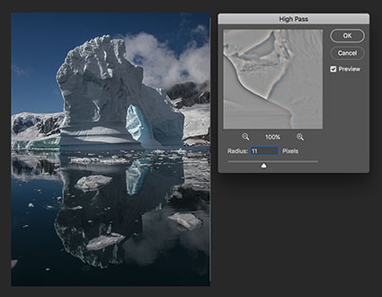
Photoshop’s filter High Pass is one every user should know. It can be either an edge sharpener or a unique luminosity contrast enhancer that produces a three-dimensional effect, unlike any other tool.

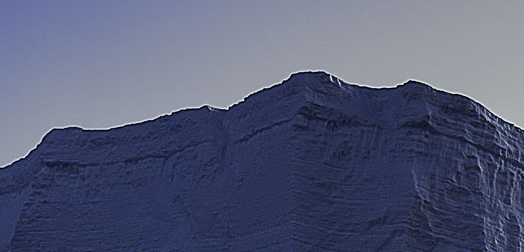
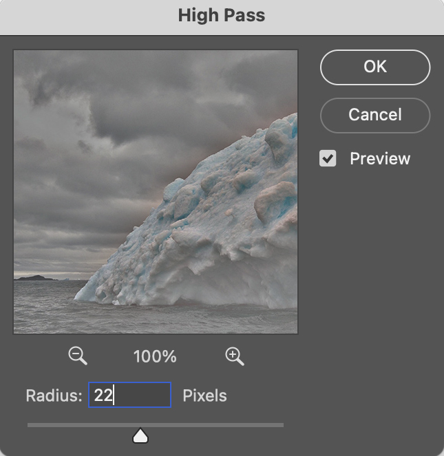
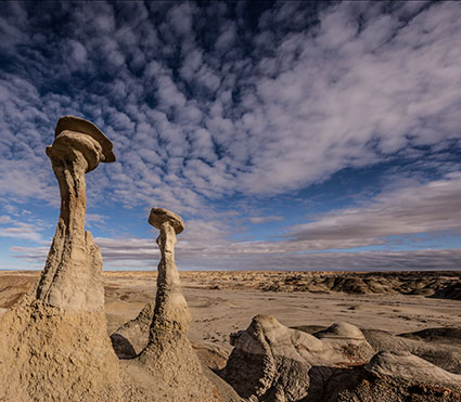
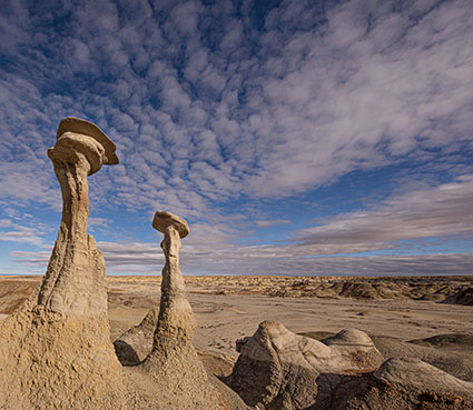
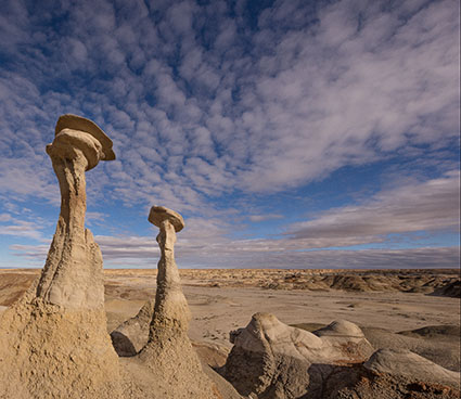
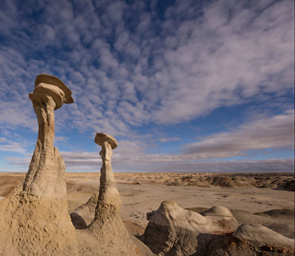
With only one slider, Radius, the differences between low and high settings can be found in the way they handle frequencies of detail: low (smooth spaces and planes), medium (broad lines and moderate texture), and high (fine lines and texture).

When you use low Radius settings, the High Pass filter adds contrast to the edges of lines. As the setting rises it brings out first coarse and then medium texture, accentuating fine texture, often confused with noise, much less.

When you use high Radius settings, the High Pass filter moves beyond sharpening and becomes tonal enhancement. The halos (light lines) and lines (dark lines) it produces become so broad and feathered that rather than only contour contrast (Think edges and thin lines.) they instead accentuate broader image contrast (Think planes chiseled by a sculptor.).  In short, images filtered with high High Pass settings look contrastier and more three-dimensional, as if all the planes in an image are dodged and burned.

Low or high, how do you choose?


Insights Members can login to read the full article.
Email:
or Sign up

High Pass Sharpening

before

after

Photoshop’s often overlooked filter High Pass is one every user should know. It can be either a unique luminosity contrast enhancer or a sharpener.

High Pass sharpening enhances edges with a softer halo and line and little or no accentuation of texture and noise. It bypasses many artifacts that trouble insensitive applications of Unsharp Mask.

High Pass sharpening requires layers so it’s only possible in Photoshop (not Lightroom or Camera Raw).

High Pass sharpening laid the foundation for Lightroom’s Print Sharpening, but in Photoshop it can also be used for creative sharpening, which can be combined with other sharpening effects and applied selectively.

Take these steps to apply High Pass sharpening.


Insights Members can login to read the full article.
Email:
or Sign up

How To Use NASA’s Photoshop Tool for Sharpening – Any Good?

“What if we can use the same sharpening technique in Photoshop as NASA’s James Webb or Hubble Telescope team? In this video, we’ll test the APF-R plug-in, which automates the APF-R method for sharpening used by space telescopes and space agencies like NASA and ESA. ”

Find more of Unmesh Dinda’s content here.
Learn more in my digital photography and digital printing workshops.

The Top 6 Softwares To Fix Blurry Photos Compared

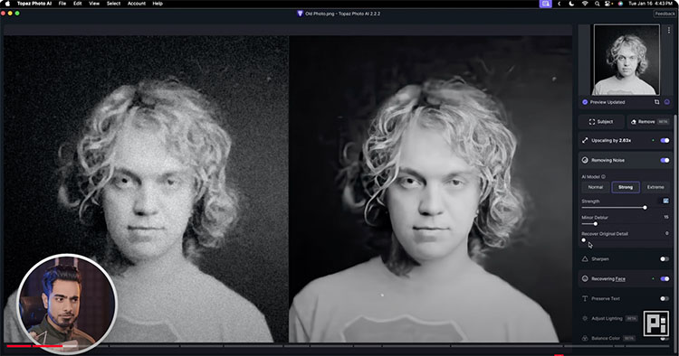
What’s the best tool to fix blurry photos? In this video, we compare the top 6 software and platforms to sharpen extremely blurry portraits and photos. From old noisy images to recovering out-of-focus areas, we will test it all. We‘ll also discuss which one is the best and learn a Photoshop trick to colorize black-and-white images. I hope this video helps. Thanks so much for watching 🙂

00:00 Intro
00:39 Topaz Photo AI
02:43 Remini
04:35 Fotor
05:44 Luminar Neo
07:19 On1 NoNoise AI
08:00 Canva
09:09 The Main Comparison
09:53 Image 1 – Noisy Old Photo
11:42 Image 2 – Slight Portrait Blur
14:43 Image 3 – Missed Focus Portrait
16:03 Colorizing the Photo
16:19 Which is the Best?

1. Topaz Photo AI: https://pix.live/photoai (Free trial available)
2. Remini: https://pix.live/remini (Free version leaves watermark and is limited)
3. Fotor: https://pix.live/fotor (Free version leaves watermark)
4. Luminar Neo: https://pix.live/luminartrial (Free trial available)
5. On1 NoNoise AI: https://pix.live/on1nonoise (Free trial available)
6. Canva: https://pix.live/canva (Can use for free)

Find more of Unmesh Dinda’s content here.
Learn more in my digital photography and digital printing workshops.

Halos & Lines In Your Photographs – How To Avoid Or Quickly Fix Them

halo and line on horizon

Nothing screams digital artifacts more than halos and lines. Bright and dark lines around the edges of objects make straight photographs look altered, and altered photographs look poorly crafted. Rarely, if ever, a good thing, their insensitivity to both contours and textures within images is supremely distracting. It's easy to eliminate these dealbreakers if you know what to look for, how to avoid them, and, when necessary, eradicate them.

Know What To Look For

First, know what to look for. If halos and lines exist, you'll find them along the edges of shapes and, sometimes, the spaces objects surround. They're most pronounced when the inside and the outside exhibit more contrast. Halos, the bright lines, are obvious; the brighter, thicker, harder halos are the more obvious, while darker, thinner, softer halos are less obvious. Lines, the dark lines, are less obvious. As they get darker, thicker, and harder, they become more obvious. 

Know How To Look For It

Halos are harder to spot in higher-resolution images that must be zoomed in (100% screen magnification) to be seen accurately. The worst is seeing them after an image is printed on a large scale. This time-consuming and expensive mistake can easily be avoided by looking closely at images before processing is finished.

Don't Produce Them

Second, know how they're produced. The quickest way to produce halos and lines is with digital sharpening, whether that's the Detail panel in Lightroom or Camera Raw, filters in Photoshop like Unsharp Mask and High Pass, or third-party plug-ins like Nik. The point here is not to avoid these tools but rather to apply them in ways that don't or minimally produce these artifacts. The next quickest way is to use any contrast tool that accentuates them; sliders in the Light panel, Curves, Texture, Clarity, and Dehaze should be monitored too. These tools won't produce halos, and if you don't have halos and lines, these tools won't accentuate them. (Careful, at high settings, Clarity and Dehaze may produce very thick, feathered halos and lines, and when they've gone too far, these artifacts look more like sloppy masking than over-sharpening. These are much harder to fix than hard lines around contours, so try not to produce them.)

See my articles on High Pass, Clarity, and Dehaze for more.

If any tool produces halos while you're processing, reduce the settings until they don't (Remember to zoom in to check this before moving on.) It's easier not to produce them than to cure them. If you discover halos and lines long after they were produced, find the slider or layer that produced them and change those settings. (In Photoshop, it's critical to adopt a flexible workflow using smart filters, adjustment layers, and layers so that you can do this quickly and easily. If you start building too many effects into flattened layers, you'll have to redo the whole thing.)

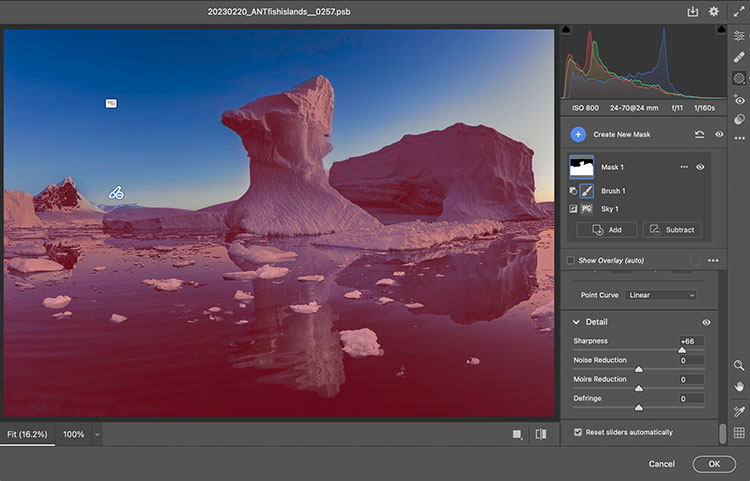
adjustment in Camera Raw masked

Mask Them

Sometimes, the artifacts produced by sharpening and contrast enhance images positively inside contours, but along contours, they look terrible. Consider applying the effect and masking it away from the contours in this case. Horizon lines are one of the most important image elements to monitor. This contour typically has more contrast than any other, not only in luminosity but also in texture, which means halos are more easily seen in the lighter, smoother sky. 


Insights Members can login to read the full article.
Email:
or Sign up

How To Intensify Photoshop’s Go To Filter High Pass With Curves

Indispensable, Photoshop’s High Pass filtration offers contrast and sharpening effects no other tool does.

(Read Curves, Clarity, Dehaze, High Pass, Texture and Sharpening Compared.)

With only one slider, High Pass filtration slip streams between sharpening or detail enhancement (at a low setting) and luminosity contrast adjustment (at a high setting). The two are intimately tied to one another; the difference is the granularity that the contrast is applied. At a low setting, High Pass filtration accentuates contrast along contours with a thin feathered line, while the flat gray areas surrounding contours on the high pass layer tend not to accentuate texture or noise. At a high setting High Pass filtration creates stronger contrast so broadly feathered that it creates a localized vignetting effect, accentuating the illusion of volume in the process.

(Read more here on How To Apply High Pass Filtration.)

The intensity of either or both of these High Pass effects can be accentuated by adding more contrast to the High Pass layer with Curves. Unlike raising the High Pass filter slider while you apply it, which increases the width of the lines on it, increasing the contrast of the layer with Curves does not; it simply makes the lines darker and the haloes brighter.

Take these steps ...


Insights Members can login to read the full article.
Email:
or Sign up

The Art Of Creative Sharpening

Download your free copy now!


Master the look and feel of detail in your images.


3 Things Sharpening Can Do For Your Images 

Sharpening Workflow

Capture Sharpening

Creative Sharpening 

Output Sharpening

Detail Frequency

Unsharp Mask 

High Pass Sharpening 

High Pass Contrast Or Sharpening – How To Choose An Optimal Setting

The Texture Slider 

The Differences Between Dehaze, Clarity, High Pass, Texture and Sharpening 

HDR For Detail Enhancement 

The Advantages Of Sharpening With Layers

 Hybrid & Multi-Pass Sharpening 

Controlling Halo & Line Independently

How To Avoid Or Quickly Fix Halos & Lines

How To Avoid Common Over-Sharpening Artifacts

Edge Masks 


Sign up for Insights for news of new content!

How Does Lightroom’s New Texture Slider Compare To Clarity and Sharpness ?

01_Dehaze_Maximum

Maximum Dehaze

02_Clarity_Maximum

Maximum Clarity

03_Texture_Maximum

Maximum Texture

04_Sharpening_Maximum

Maximum Sharpening

05_Texture_Negative

Negative Texture

06_Clarity_Negative

Negative Clarity

Think of Adobe Lightroom Classic and Camera Raw’s new Texture slider as producing an effect that lies somewhere between the Clarity and Sharpness sliders.

It’s closer to Sharpness so when you apply it, rather than looking at the full image, zoom in to 100% to evaluate the detail accentuation it produces. So, use it more for detail enhancement than contrast.


Insights Members can login to read the full article.
Email:
or Sign up

What Are The Differences Between Lightroom and Photoshop’s Curves, Clarity, Dehaze, High Pass, Texture, and Sharpening ?

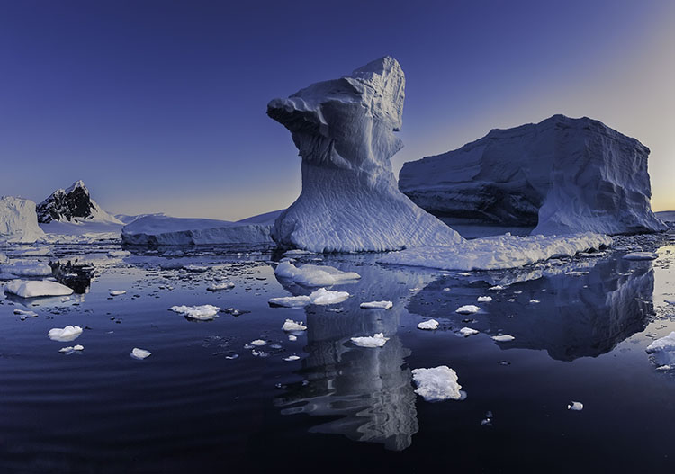
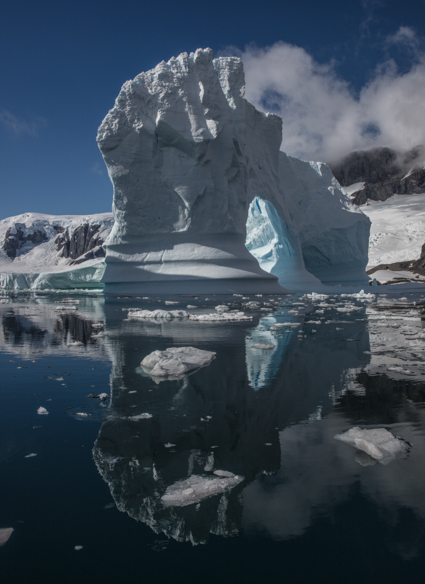
20170206_ANT_yalourislands _458
Lightroom and Photoshop offer an impressive array of tools for adjusting an image’s contrast. At some point luminosity contrast adjustment tips over to affecting image detail (contour and texture) more than overall lightness. Deciding exactly how you want to affect lightness, contour, and texture is the key to deciding which tool to use and how to use it.

The following progression moves from the smoothest to edgiest tools – Curves, Clarity, Dehaze, High Pass, and Sharpening. The differences between these tools can be found in the way they handle frequencies of detail; low or smooth, medium or broad lines and moderate texture, and high fine lines and grain.
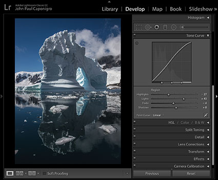
01_Curves

Curves

Curves creates the smoothest effects. It simply affects light and dark values. With it, you can fine tune the relationships between different values with unparalleled precision. Curves ignores texture and contours. If either is affected it’s simply because those areas are lighter or darker, not because they have been targeted. Along with contrast, Curves also boosts saturation somewhat. (If Curves is applied in Photoshop, this saturation shift can be removed by using a blend mode of Luminosity.)
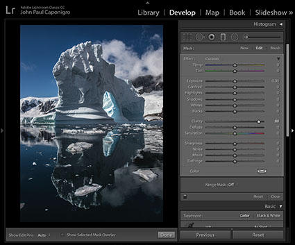
02_Clarity

Clarity

Clarity offers the second smoothest effects. It pays significant attention to contours. The contrast it adds to contours is smoothed or broadly feathered. Think of it as a local vignetting, not for the frame, but for areas within contours. To make the effect more realistic, it darkens the dark side of contours more than it lightens the light side of contours edges, greatly reducing visible bright halos. Clarity makes images look clearer for two reasons; one, because the overall contrast appears to remove haze; and two, because the edge contrast makes images appear better focused or sharper. Clarity, particularly strong applications of it, will accentuate texture affecting medium frequency detail even more than high-frequency detail. Strong applications of Clarity will boost saturation significantly, which can be removed with the Saturation slider. Clarity does not exist in the Photoshop Image > Adjustments menu but can be applied in Photoshop with the Camera Raw filter.
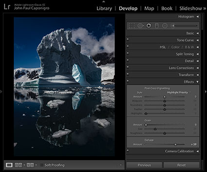
03_Dehaze

Dehaze

Dehaze offers the third smoothest effects. It creates effects that are similar to Clarity, only stronger. Dehaze darkens shadows and rather than brightening the highlights it simply pulls out more separation by darkening the lower values in these areas. Strong applications of Dehaze may even reveal detail you can’t see with the naked eye. Dehaze affects larger areas of contrast, sometimes losing the ability to distinguish between smaller areas. While Clarity boosts saturation somewhat, Dehaze boosts it more and often creates color non-uniform shifts. (There is a cure for this, which I cover in a separate article.) Dehaze does not exist in the Photoshop Image > Adjustments menu but can be applied in Photoshop with the Camera Raw filter.
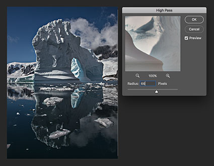
04_HighPass_High

High Pass High

05_HighPass_Low

High Pass Low

High Pass filtration drives contrast into edges. It produces significantly different effects at low and high settings. At low settings it affects contours most, only slightly affecting texture and having little or no effect on overall contrast. At high settings it produces localized vignetting similar to Clarity but with less feathering, making it an excellent tool for emphasizing planar contrast. Be careful, it does not have the halo suppression built into Clarity. Only high settings create saturation shifts, which are localized not uniform. Remove this by desaturating the layer you apply the filter to. The High Pass filter is only available in Photoshop and is usually applied on a duplicate layer set to a blend mode of Overlay.
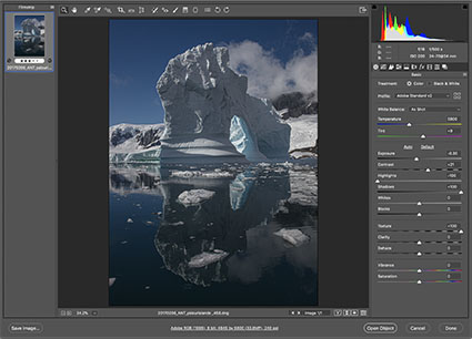
Texture_4235

Texture

The Texture slider produces effects that lie between the Clarity and Sharpness sliders.

When compared to Clarity, the Texture slider does not increase saturation and it produces an effect significantly more targeted to edges. With little or no localized vignetting, it has less effect on overall contrast (Think of it as a micro-contrast.) and will not produce planar or volumetric accentuation. While it does produce more of an overall contrast effect than Sharpness, Texture is much more suited to detail enhancement. Think of it as a broader softer Sharpness rather than a finer edgier Clarity.

When compared to the Sharpness slider, the edge it produces is not as pronounced (It’s more feathered.) nor does it increase artifacts or noise as much. Texture increases or decreases apparent sharpness in mid-frequency detail. Its effects on smooth (low frequency) and fine (high frequency) detail are minimal. Think of it as producing an entirely different mask that removes effects from low and high-frequency detail rather than the one produced by Sharpening’s Masking slider that removes effects first from smooth areas and then gradually converges on edges at higher settings.
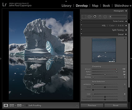
06_Detail

Sharpening

The Detail Panel’s Sharpening sliders aggressively target edges. It offers four sliders – Amount, Radius, Detail, and Masking. Amount determines the increase in contrast. Radius accentuates contours in thinner (lower setting) or thicker (high setting) areas. Detail targets the effects of the previous two sliders into lower (less texture) or higher (more texture) frequencies of detail. Masking creates a mask that removes the effects of the other sliders from smooth areas at low settings and from all areas but contours at its highest settings. These sliders produce no overall contrast effects and little to no saturation shifts. (These detail sliders don’t exist in the Photoshop Image > Adjustments menu. Photoshop’s filter Unsharp Mask offers identical Amount and Radius sliders but it lacks the Detail and Masking sliders. Instead, it offers a Threshold slider that allows you to remove the effect from adjacent areas that have less contrast than the Threshold you set.) These tools are the ultimate tools for accentuating texture and contour.

Experiment. Develop your eye for all of the possibilities these tools open up for you. You’ll be amazed by what they can do. And when you master them, your viewers will be amazed at how good your images look.

Read more on Color Adjustment here.

Learn more in my digital printing and digital photography workshops.

View test files with maximum applications of these tools below.
Read More