How to Layout and Design Your Book Like a Pro

How to Sequence and Design Your Next Book Like a Pro from Blurb Books on Vimeo.

“Pro photographer and book designer Mat Thorne presents an introduction to book design principals. This webinar covers an overview of typography, essentials of cover design, and laying out front & back matter. Mat also shares examples and offers inspiration from published photography books.”
Find more bookmaking resources here.
Learn more in my digital printing and digital photography workshops here.

Use Space – Tracking & Leading

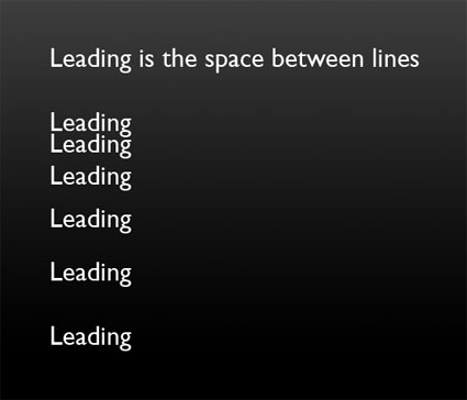
Use space to improve your design. There’s the space around blocks of text – margins. And there’s the space between elements of text – tracking and leading. Tracking is the space between letters. Leading is the space between lines. If tracking and leading are too tight, words appear cramped and are harder to distinguish from one another. If tracking and leading are too loose, units of text fall apart into separate units. Use enough space to help text rest gracefully on the page and breathe, but not so much space that it weakens the relationships between separate pieces and they drift apart.
tracking3
leading
Find books on design I recommend here.
Learn more in my Fine Art Digital Printing Workshops.