Why Desaturating Is The Worst Color To Black & White Conversion Method
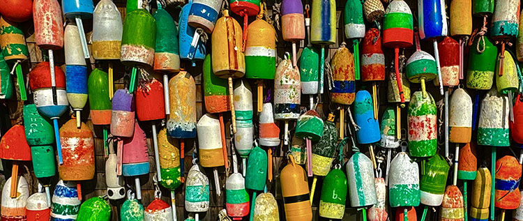
1 – Full color

2 – Vibrance -100
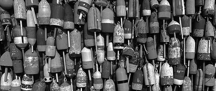
3 – Saturation -100

4 – B&W Mixer with custom settings


Why is desaturating the worst color-to-black-and-white conversion method?

In short, it makes mud.

Here’s why.

When set to -100, Saturation changes different hues to similar neutral values; it loses tonal separation.

Vibrance is a worse choice; when set to -100, it retains some color.

Tools like Lightroom and Camera Raw’s B&W Mixer or Photoshop’s Black & White adjustment layer are much better because they allow you to retain tonal separation and adjust which hues become light or dark. They work very well for basic color to black-and-white conversions.

Photoshop offers even more control, first by allowing color to be adjusted before conversion and second by adding the ability to make local conversions so that the same color in different areas of an image can be converted differently.

So, when you’re making color to black-and-white conversions, stay away from Saturation and Vibrance and choose Lightroom/Camera Raw for basic global conversions, or when you need more, use Photoshop for the ultimate preview of possibilities and the most control.

Read more about B&W here.

Learn more in my workshop B&W Mastery.

3 Easy Ways To Make Colors Pop In Photoshop – Jesus Ramirez

.
This video will teach you three easy methods to make colors in your photos stand out in Photoshop.
.

How To Master Saturation In Your Images

Saturation Is An Essential Key To The Success Of Your Images

One of the most distinctive features of a visual artist’s use of color is their use of saturation. When you think of Ansel Adams’ photographs, you think of neutral images rather than highly saturated ones. When you think of Matisse’s paintings, you think of supersaturated images rather than neutral ones. Think of your use of saturation as an essential element that will help you define your own signature style.
One of three elements of color (luminosity, hue, and saturation), saturation can give your images specific qualities of energy and light. Here are five things you can do with saturation: one, increase energy and impact; two, add complexity by revealing hidden hues; three, restore life to listless hues; four, calm colors that are distracting; or five, produce softer semi-neutral and pastel palettes.

Read more about Saturation here.

Together, Adobe Lightroom and Photoshop offer an impressive, almost overwhelming, array of possibilities for controlling saturation. Do three things before you choose a tool to adjust saturation with. First, understand and develop your eye for saturation. Second, adopt a consistent strategy for exploring the possibilities it offers your images. Third, understand the differences between the tools, both how they function and the effects they produce.

Know What To Look For

Knowing what to look for will help you choose a direction, a tool, and how far to go with it. It will also help you evaluate the results you produce – and quite possibly improve them further.


Insights Members can login to read the full article.
Email:
or Sign up